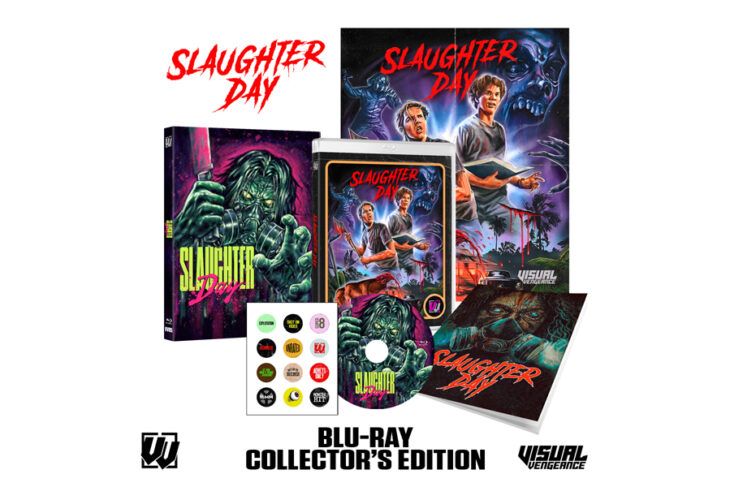
5 Horror Books That You Can Judge by Their Covers


79% of people say that a book’s cover plays a decisive role in whether they purchase the book or not. Readers don’t want to see books with repetitive, cliché covers as those covers don’t entice people to want to pick up their respective books and read them. It’s a common phrase that you shouldn’t judge a book by its cover, but if the cover does a good job then it’s the best way to reveal what sort of story you’re in for. Horror book covers do generally stick to a few conventions, mainly the colors they use, but if the design can back it up then it’s fair game for some really creepy and eye-catching covers.
Dracula, 1980s Edition
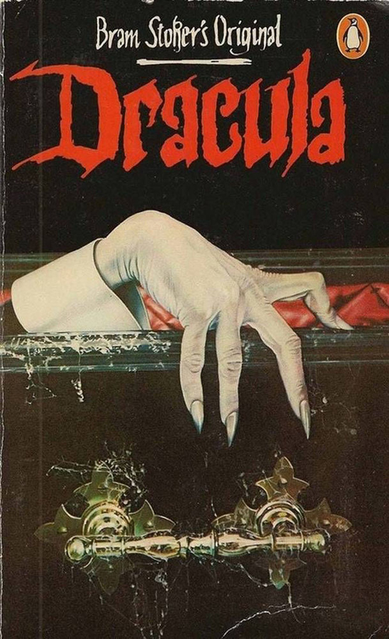
Bram Stoker’s Dracula was first published in 1897, but it’s the 1980s cover by Penguin books that really catches the eye. Opting for fingernails over fangs, the cover shows Dracula’s colorless hand actively clawing its way out of a weathered coffin. It sticks to a traditional and effective color scheme of black and white with a burst of bloody red for the title ‘Dracula’ scrawled across the top and a peak of the coffin’s lining in a similar shade. By the time this was released the story of Dracula was well-known and this cover offers something a little different to previous ones to draw readers in.
The Silence of The Lambs, 1988
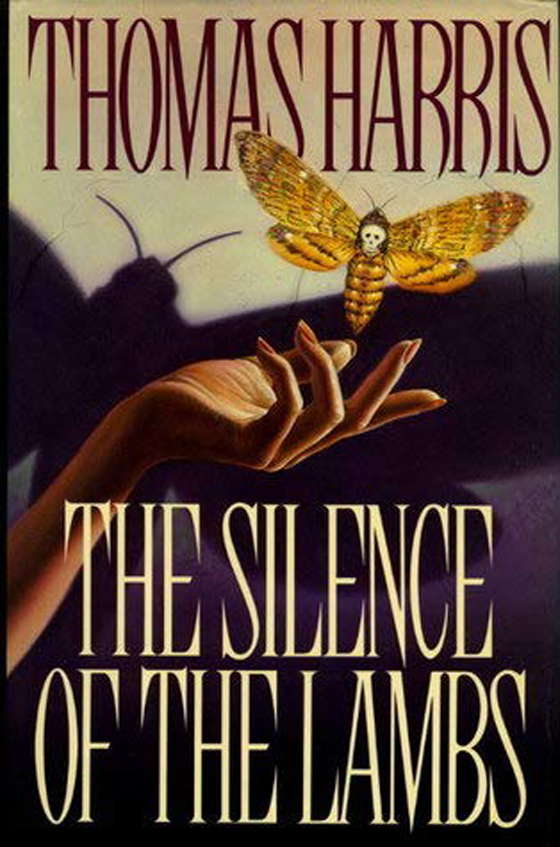
The first US edition of The Silence of the Lambs book cover looks fairly harmless at first until you take a closer look and notice the symbolism. The insect flying from the woman’s hand appears to be a beautiful butterfly, but is actually a death’s-head hawkmoth which are suitably named for the sinister skull-like face that sits between their wings. The cover exaggerates the skull to make it more apparent, despite being a small part of the cover. The moth is an omen of death in some cultures, making it a particularly fitting symbol for a story immersed in the death and cannibalism that surrounds Hannibal Lector. The shadow the moth casts in the background is unusually large, which combined with the skull suggests the horror in store for readers.
Goosebumps: The Barking Ghost, 1995
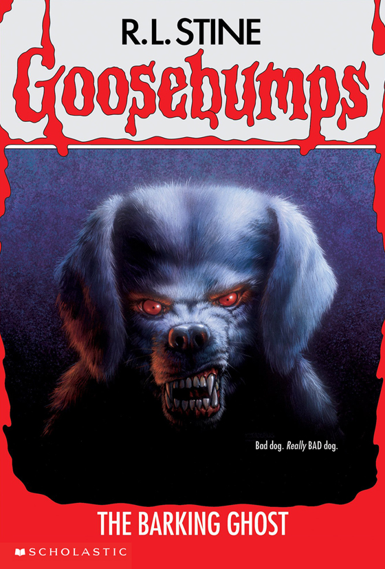
Horror books are a less common genre for children, but Goosebumps changes that with a series of 62 books, selling over 300 million copies worldwide making it the second best-selling book series in history. The covers in the series are often colorful and artistic to make them more child-friendly, but The Barking Ghost goes back to the classic color scheme for horror stories: black and red. A close-up of a realistic drawing of a dog aggressively baring his fangs and teeth with a ghostly white shimmer lighting up his fur is the focus of the cover. A red border surrounds him and is also used in his eyes and gums to add to the sinister look. The use of a canine illustration over a photograph makes this more appealing for children without taking away from the fact that it’s a horror story.
Coraline, 2002
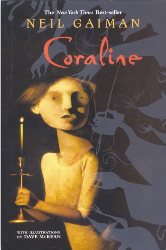
Coraline is a horror book aimed at children again, but the interesting story draws in adults too, and rightfully so. It was adapted into a film by Henry Selick who also directed Tim Burton’s The Nightmare Before Christmas, giving it a similar vibe. The book’s cover features Coraline, a young adventurous girl, holding a candle and looking spooked, as if she’s discovered something while out exploring in the dark when she shouldn’t be. Everything appears ‘normal’ until you realize her eyes are just small black dots and there are ghostly arms floating around her with sewing needles and threads, perfectly tying in with the story.
This Book Is Full of Spiders: Seriously, Dude, Don’t Touch It, 2012
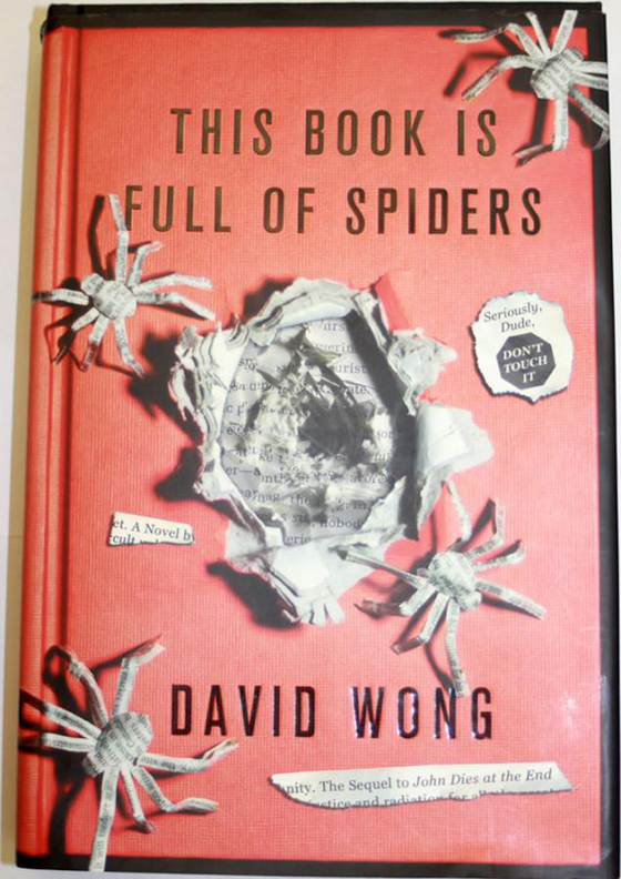
This one is a comic horror novel and steps outside of the box when it comes to conventions but is very effective in doing so. Its eye-catching orange background features spiders made from the book’s pages and bursting out of the middle. Clippings from the pages add additional text that blends in. The title alone tempts readers as people can’t resist touching something they’ve been told not to, so they’re already picking up the book before examining it more closely, where the clever and well-thought design of the cover makes it hard to resist.
A lot of horror stories depend on their content or the author’s name to help sell it, but the artwork on the covers should be taken just as seriously. People do judge books by their covers and assume the story based on what they can see, so it should be something to grab their attention and then keep them intrigued. Some books’ covers become more iconic than the stories behind them, which can only be a sign of a job well done.